Product Design
The product experience for Figureflow is a continuous development and refinement. User feedback, feature requests, market expectations, and product improvements all inform the design decisions.
Modules
The app consists of the following modules:
Onboarding
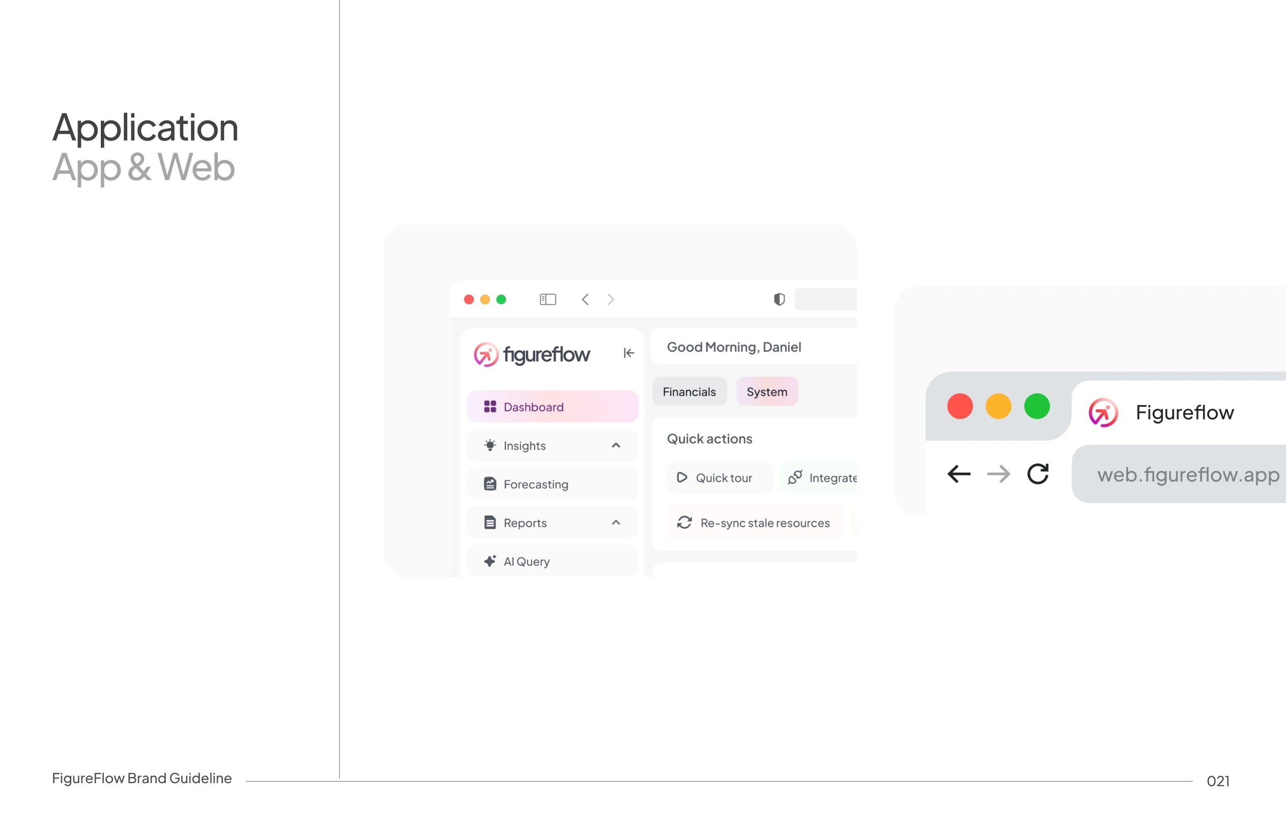
Dashboard
Insights
Forecasting
Reports
AI Query
Data Sources
Notifications
Help & Support
Settings
Each of these modules will be reviewed in this body of work, accompanied by a brief explanation of their different sections and functions.
Onboarding
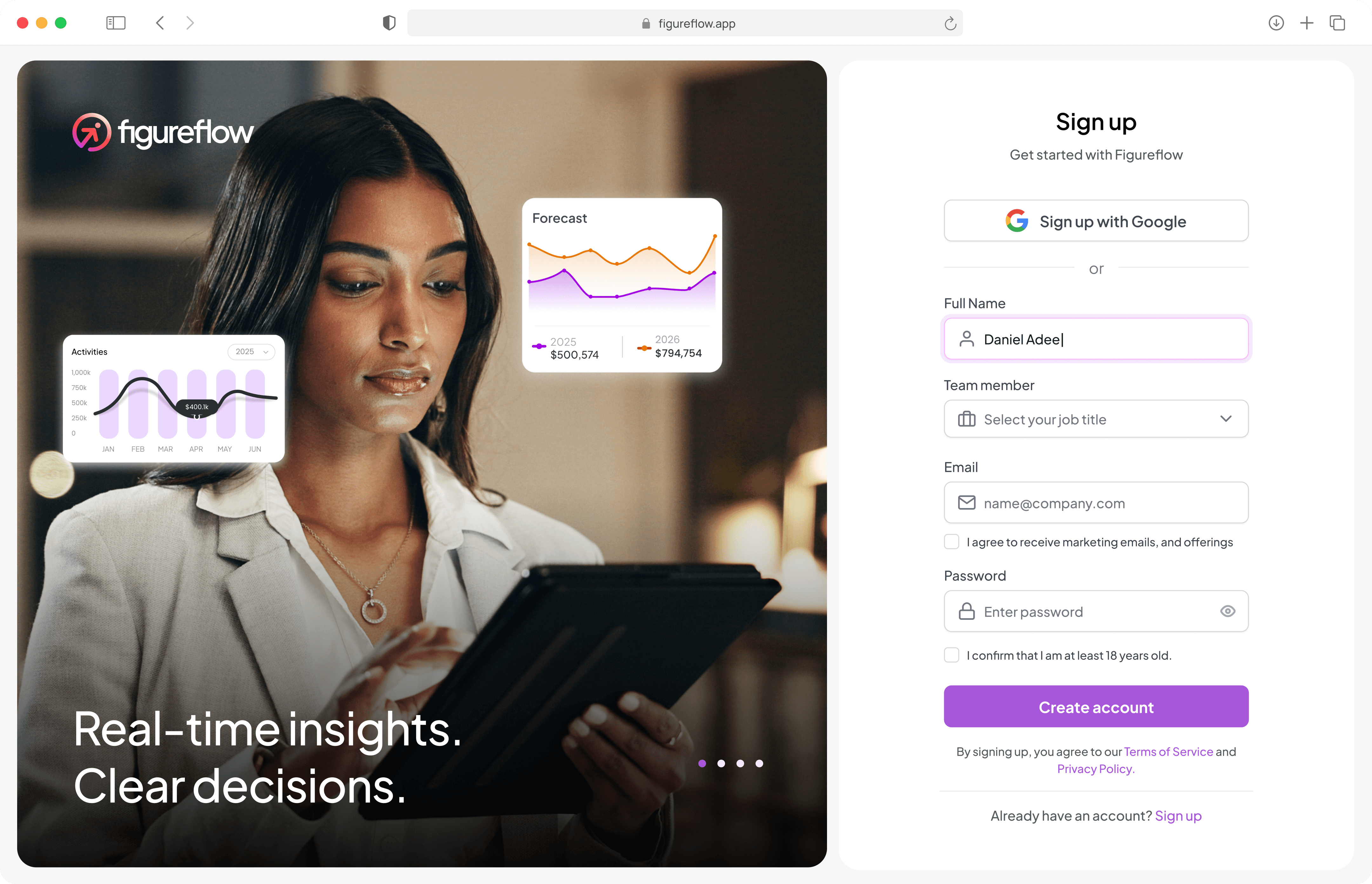
The onboarding experience is designed to feel guided and "easy". Sections includes:
Sign-in/Sign-up pages
Business profile setup for first time users or users that have just signed up
Billing



Dashboard
The Dashboard is designed to answer one core question immediately: "How healthy is my business right now?"
Instead of overwhelming users with raw accounting data, it surfaces what matters most — financial health, key metrics, forecasts, and risks in a structured and explainable way.
Financial Health Summary

At the top, users can switch between:
General
Profit & Loss
Balance Sheet
Cash Flow
The “General” view translates financial data into a readable executive summary. Instead of numbers alone, users get context:
Revenue performance, expense behavior, liquidity position, and overall stability explained in plain language. This reduces reliance on accounting knowledge and increases clarity.
KPI Overview
A focused 4-KPI strip highlights:
Cash Runway
Burn Rate
Gross Margin
Net Cash Flow
This can also be expanded by adding more KPIs to highlight. Users can also click on each KPIs for a detailed overview which then leads to the insights section.
Forecast Snapshot
The Forecast section combines:
A visual projection graph
An AI-generated summary
Users see expected revenue trends, cost behavior, and net income outlook alongside the reasoning behind those projections.
This shifts the product from not only reporting the past to present but also preparing for the future.
AI Assistant/AI Query
The right-side assistant and the AI Query section of the app makes finance conversational. This section is readily available across different sections of the app
Users can ask:
Revenue trend questions
Margin comparisons
Working capital checks, and alot more based on their data.
It removes friction from financial exploration and makes insights conversational and accessible in natural language.
System View/Section

Switching to “System” changes the focus from analysis to management.
Users can:
Manage data sources
Resume reports
Monitor alerts
Switch organizations
This keeps financial insight and operational control clearly separated.
The Design Intent for this Dashboard
Figureflow Dashboard can be considered a decision surface built for businesses and it balances three layers :
What happened
Why it happened
What might happen next
Insights Module

The Figureflow insights module moves beyond reporting to interpretation, it also highlights whats needs attention and why. Generally it turns Financial Data into actionable signals.
The Insights module is divided into 5 core sections:
Liquidity
Efficiency
Profitability
Solvency
And the Alert panel
Each category displays the key metrics relevant to that financial dimension.
For example:
Liquidity focuses on cash flow, runway, working capital, etc
Efficiency focuses on burn rate, payable cycles, operational ratios, etc.
Profitability focuses on margins, net income, EBITDA. etc
Solvency focuses on long-term stability and financial leverage.
Detailed KPI View


Each KPI can be expanded into a detailed view. Users can switch between:
Overview (visual trend)
Data Table (monthly breakdown)
The Overview shows:
Historical performance
Projected values
Variance from previous month
The Data Table provides full transparency for finance teams who want exact figures.
Below both views, an AI summary and on the right side Alerts panel and configuration.
Alerts panel & Configuration
The alerts are grouped by category based on the financial data, and each alert shows:
Severity (warning/critical)
Threshold Comparison
Time context
Quick "Review" Action
This makes the system proactive rather than reactive. As users don’t have to discover problems themselves.

Actual examples include setting minimum cash runway, defining acceptable burn rate, or adjusting current ratio targets. This supports different business models. A startup and a mature company shouldn't share the same risk tolerance.
Alert Deep Dive

When a user opens an alert the system provides:
Executive summary
Root causes
Contributing factors
Impact assessment (financial, operational, strategic)
Risk level & timeline
Recommended actions
This transforms alerts from simple warnings into structured decision briefs.
Forecasting
Forecasting is where Figureflow moves from showing what happened to predicting what's next. Users build financial models inside the platform using their real connected data — no exporting to Excel, no disconnected spreadsheets.
Model Overview

Selecting one indicator (e.g., Revenue) isolates it on the chart with tooltips showing exact values and year-over-year change. The summary adapts to focus on that metric's trajectory and risks.
Users can also compare two models side by side. The chart overlays both on one timeline, and the AI generates a summary explaining where they diverge and why.
Single Metric & Model comparison
The forecasting home screen shows all models as tabs, each with a version number. One model is marked as the Master Model — the active forecast the business runs on.


Users filter by financial indicators (Revenue, Operating Expenses, etc.) and the chart updates to show actuals alongside projections. Forecast years are styled in purple so the line between real data and projections is always clear. Below the chart, the AI writes a plain-language summary of the trends and drivers, and users can ask follow-up questions from a prompt input beneath it.
Assumptions Panel — Breaks down the model's key drivers on the right: Expense growth, Revenue trajectory, and Runway estimate. Keeps the "why" behind the forecast always visible.
Forecasting Assistant — A dedicated AI chat with suggested prompts like "Extend runway to 12 months" or "Break even by 2026." Users describe a goal, and the assistant adjusts the model accordingly.
Direct Editor

The spreadsheet-style interface where users edit actual numbers, organized by Income Statement, Balance Sheet, and Cashflow Statement. Columns are split into Actual (historical) and Forecast (projected, in purple). Users click any cell to edit, with clear labels showing exactly what's being changed.
Top tools include an Indicator Guide (explains what each item means) and Set Budget (define targets the model tracks against).
AI Chat & Version Control
Every save creates a new version with a change log (e.g., "Price Change updated to 6% → 23 cells recalculated"). Users can switch versions or undo.
After each edit, the AI responds with context — how the change affects break-even, cash flow, or margins. A prompt input lets users ask questions or request adjustments without touching cells. It's a spreadsheet that talks back.
Other sections
Forecasting is where Figureflow moves from showing what happened to predicting what's next. Users build financial models inside the platform using their real connected data — no exporting to Excel, no disconnected spreadsheets.
Reports
Reports lets users generate professional, board-ready documents in minutes. Annual reports, investor updates, and board decks, all auto-filled with live data from the platform. Templates are customizable, always reflect the latest numbers, and can be shared or exported securely.


Data Sources


This is where users connect their systems to Figureflow. ERPs, banking platforms, accounting tools, or uploaded files. Once connected, data flows in automatically and stays in sync, so every insight, forecast, and report is built on real, up-to-date numbers.
Notifications

Keeps users informed on what matters. Budget thresholds, forecast changes, report completions, or anything that needs attention. Notifications surface important financial events without overwhelming the user.
Settings
Where users manage their account. Profile details, team access and permissions, and billing. For businesses with multiple users, this is also where roles are configured to control who can view, edit, or manage different parts of the platform.
After each edit, the AI responds with context — how the change affects break-even, cash flow, or margins. A prompt input lets users ask questions or request adjustments without touching cells. It's a spreadsheet that talks back.
Help & Support
A self-serve resource hub with FAQs, how-to videos, and direct access to the support team. Designed to help users get unstuck quickly without leaving the platform
Marketing Design
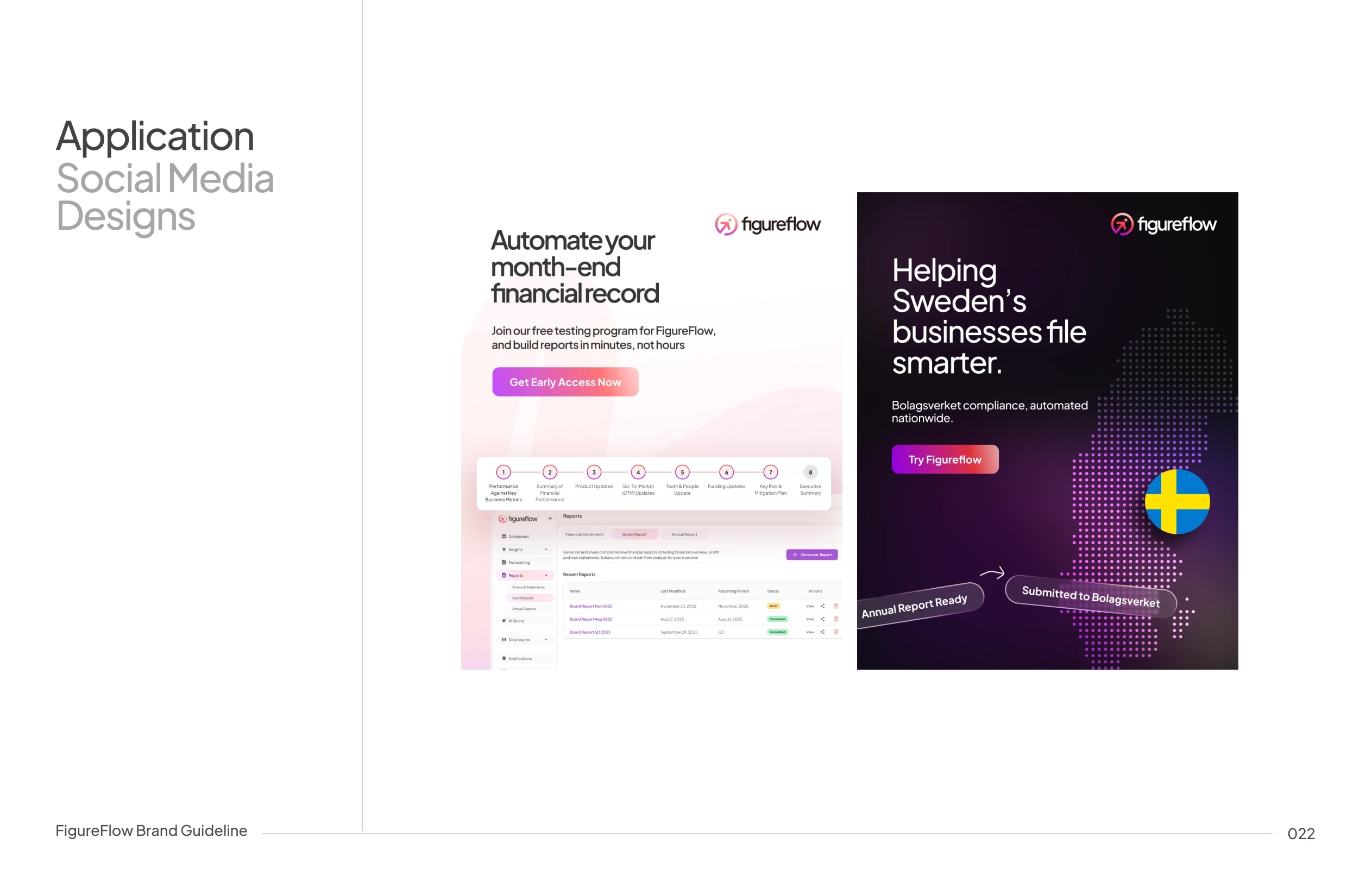
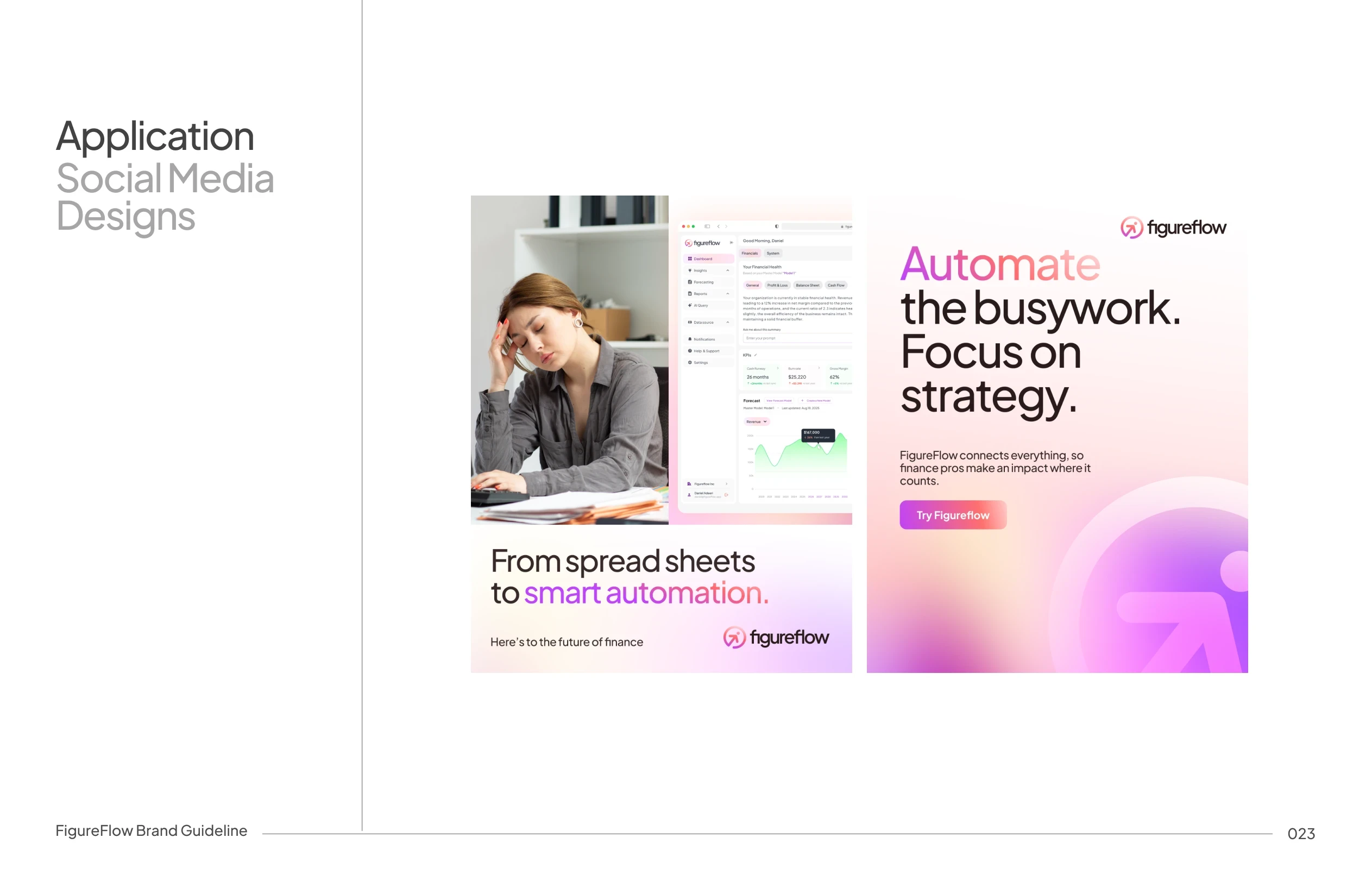
Crafted motion assets, social media graphics, and ad creatives to support product launches and drive brand awareness across channels.
Motion
Product Launch Video
Statics and Ad designs




Website Design
The goal of the website design was to introduce FigureFlow to the market with a modern, trustworthy, and product-driven presence. It needed to highlight who it serves (Founders, CEOs, Finance Managers & Teams), communicate its solutions, and visually connect the brand with the product experience through motion and storytelling.
Web Motion
Main Landing Page

Annual Report Landing Page

Brand Design
Figureflow needed a brand that feels credible and enterprise-ready while remaining accessible to non-finance founders, and that can scale seamlessly across product UI, dashboards, marketing, and investor-facing materials balancing approachability with authority.
Strategy
Figureflow positions itself as a decision-making partner rather than just a dashboard, an intelligent guide that explains why numbers matter while delivering a modern CFO experience for startups and growing businesses.
Think about "Financial Clarity, without Confusion"

Brand Personality is centered around the following:
Clarity: No noise or no unnecessary decoration
Intelligence: Insight-driven by AI
Calmness: Reduces anxiety around finances
Trust: Feels secure and reliable
Forward-looking : Built for planning and not just reporting
Logo Concept
The early stage of this logo work began with a logo case study, which the Figureflow team approved for production; this also marked the first stage of the project's practical deliverables. You can view it here before proceeding.
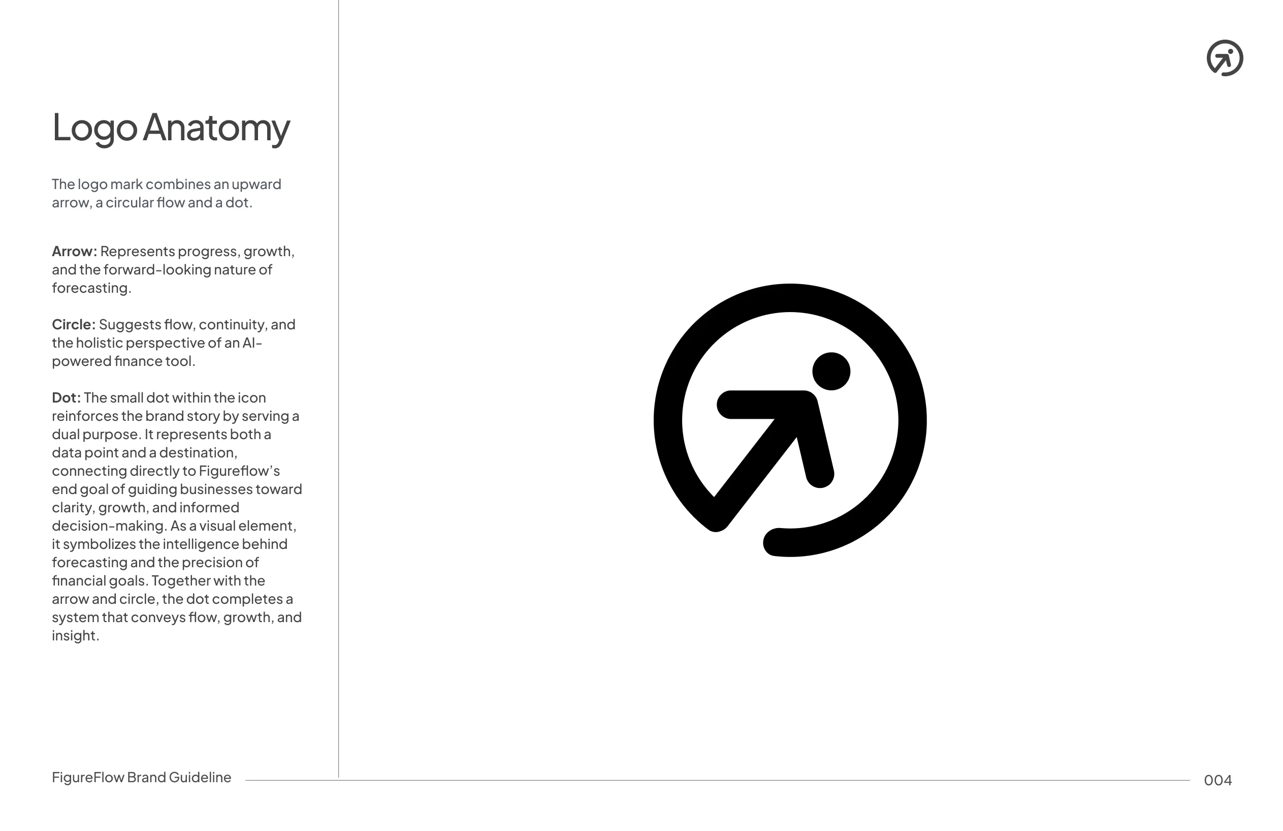
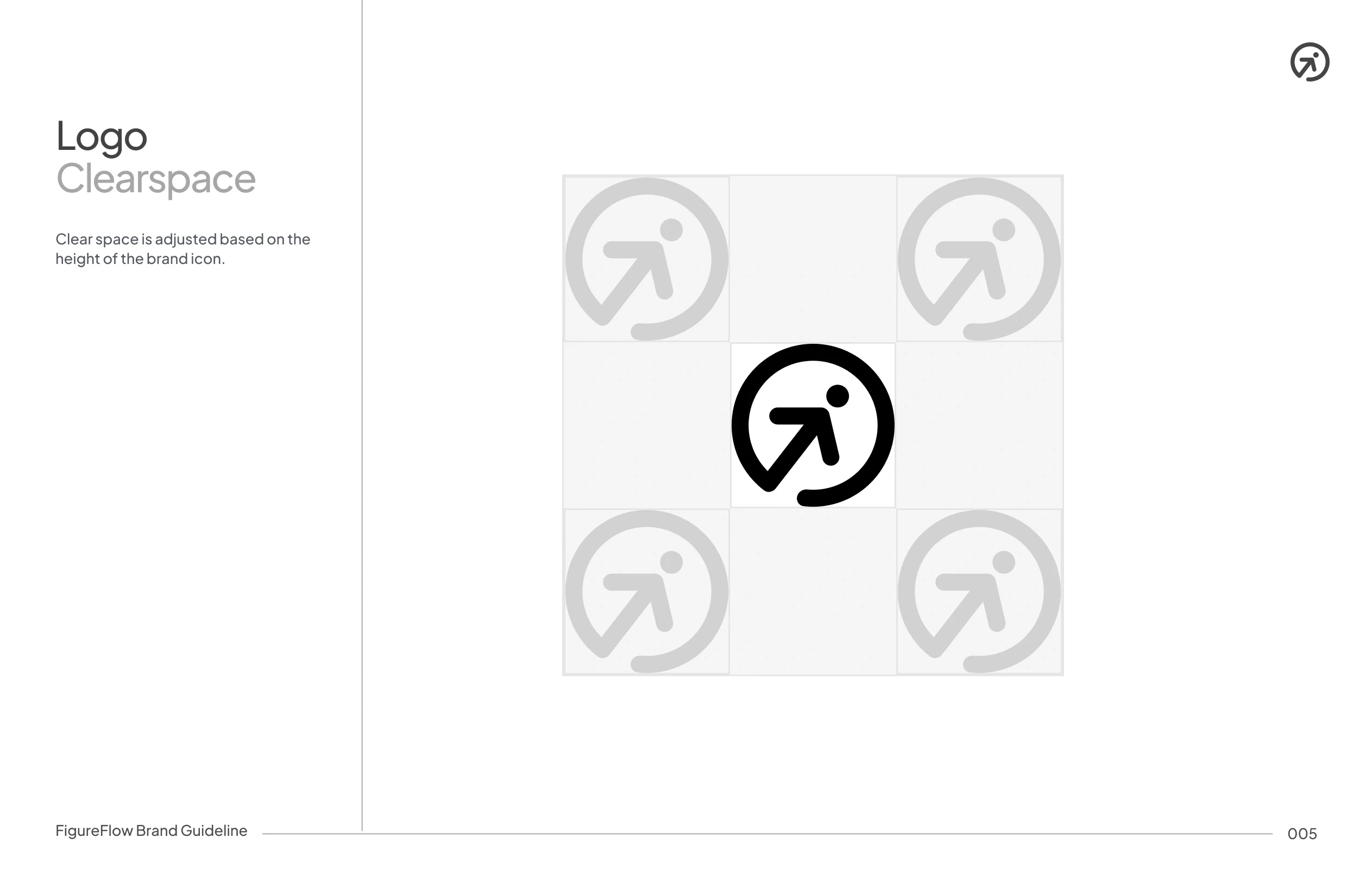
The Figureflow logo is built around the idea of movement and progression, numbers flowing into insights featuring a modular, balanced geometry that works seamlessly as both a wordmark and an icon, and is optimised for dashboards, app icons, and marketing use.


Color System
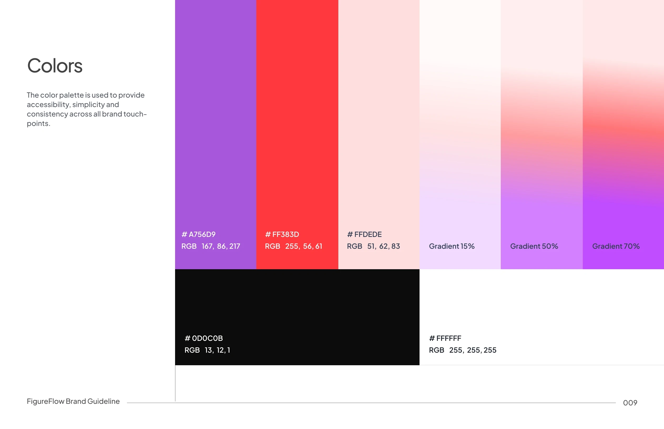
Figureflow’s color system is built around a focused primary palette of purple and shades of red, supported by neutral black and white for balance and clarity.
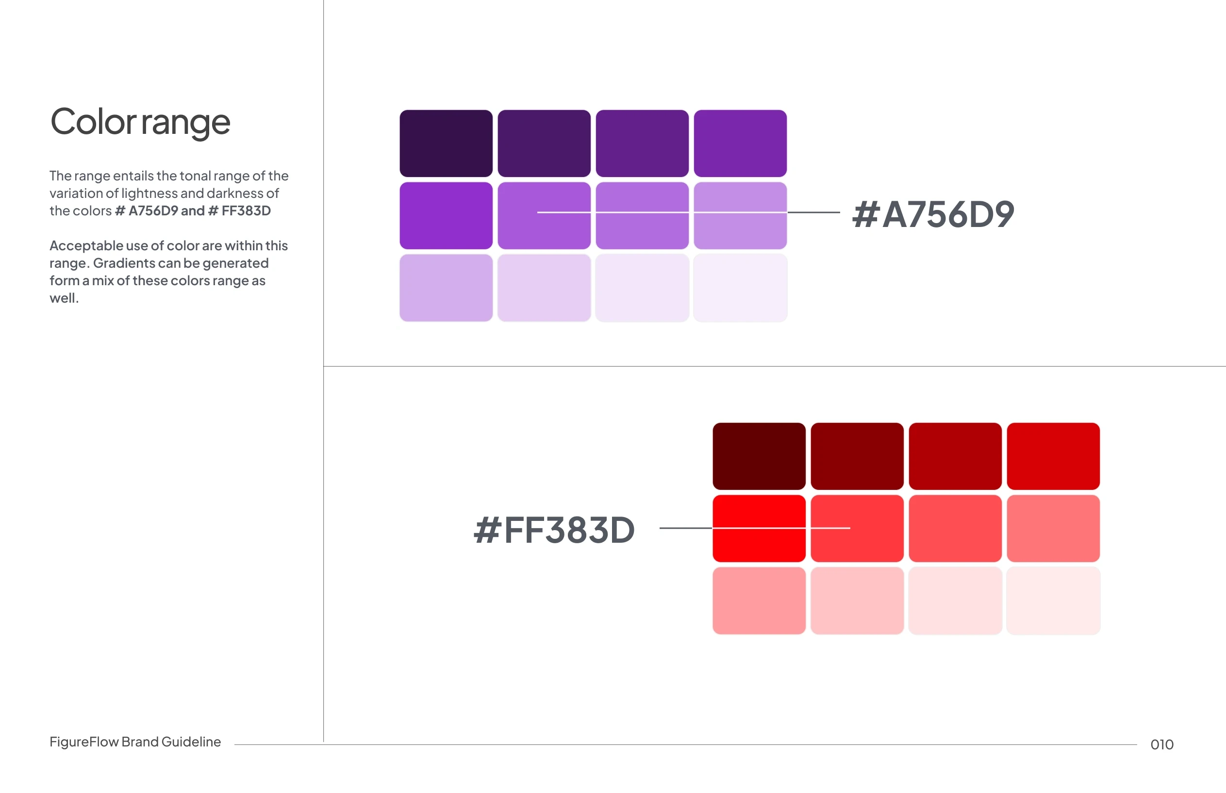
Purple represents intelligence, analysis, and long-term thinking, while red is used deliberately to surface key actions, changes, and critical financial signals. Controlled tonal ranges and gradient variations allow the colors to scale across UI states, data visualization, and brand applications.
The system is designed to be expressive and ensure consistency across product, marketing, and brand touchpoints.
Typography

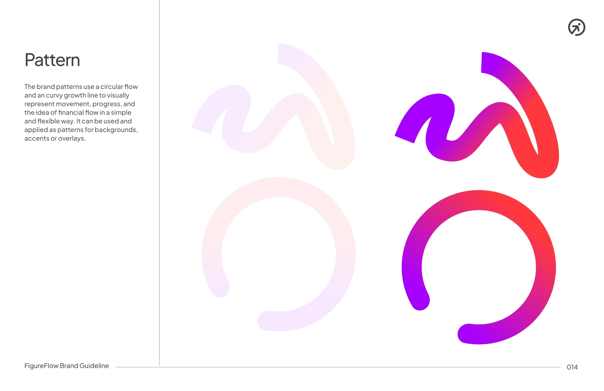
Brand Pattern
Imagery

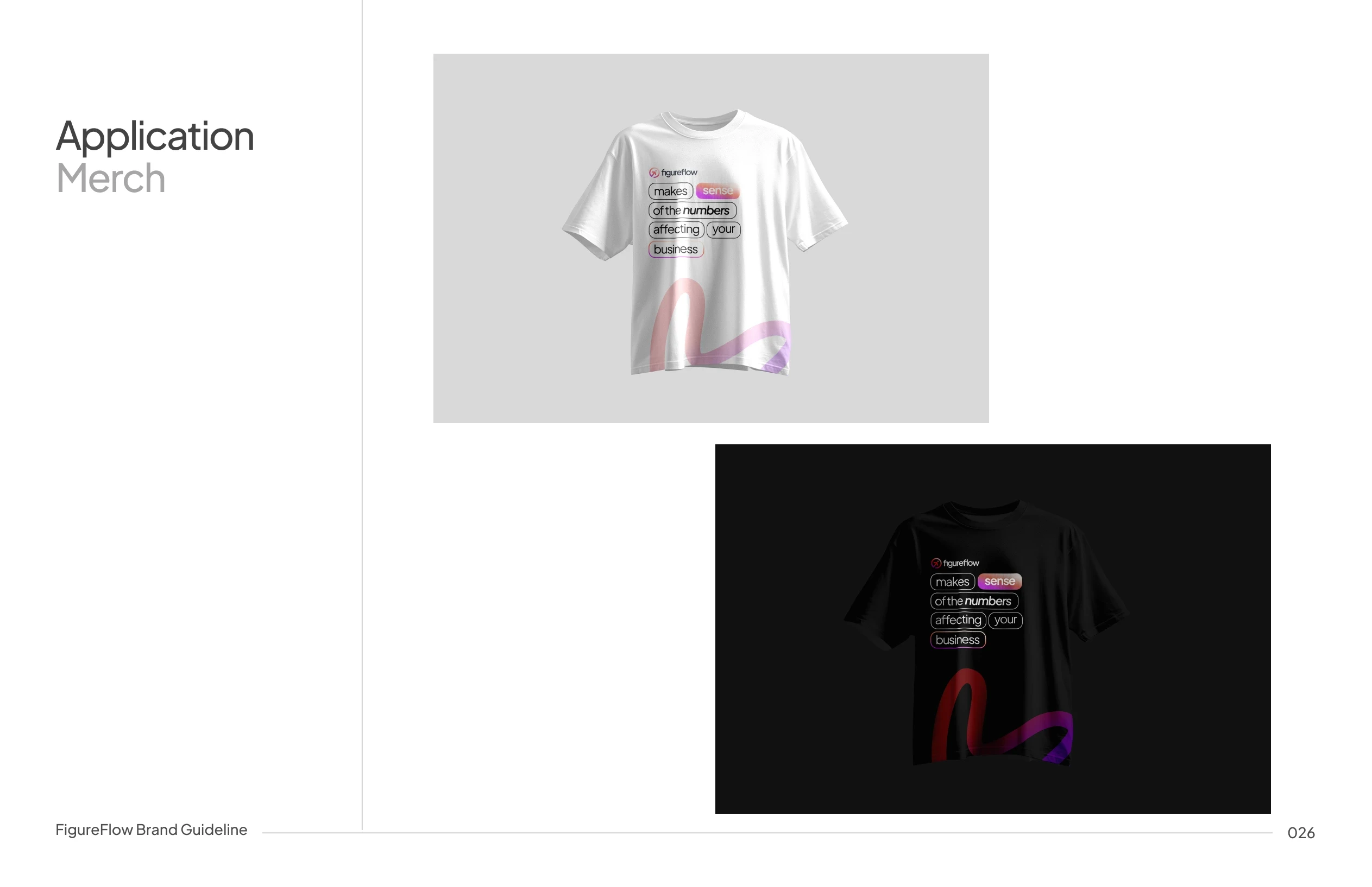
Application and Use cases
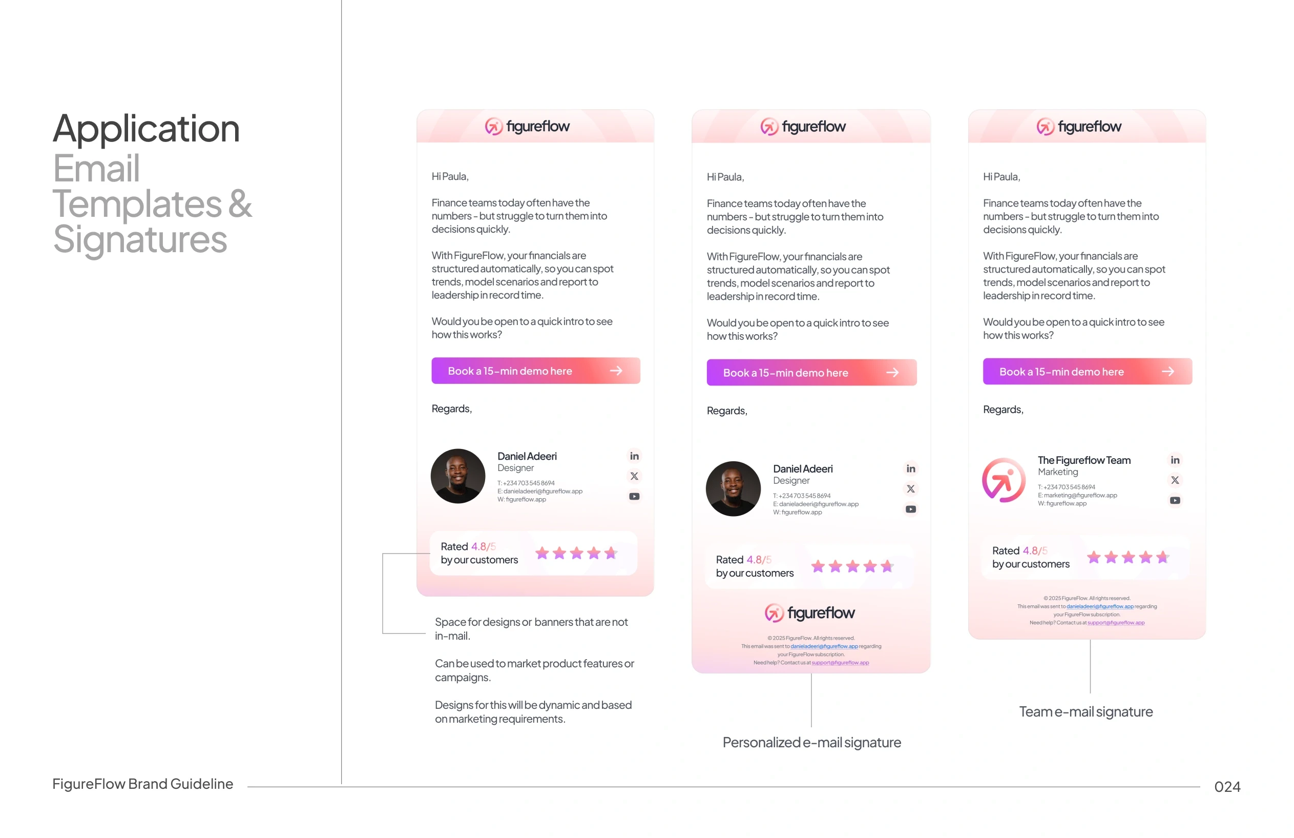
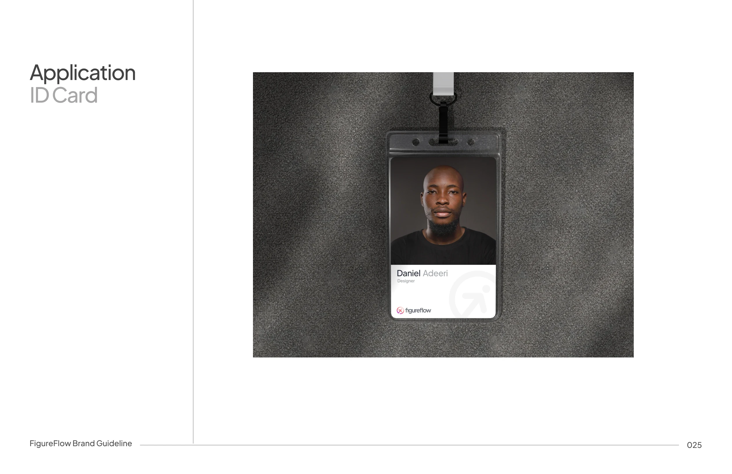
The identity system scales across:
- Web app dashboards
- Website
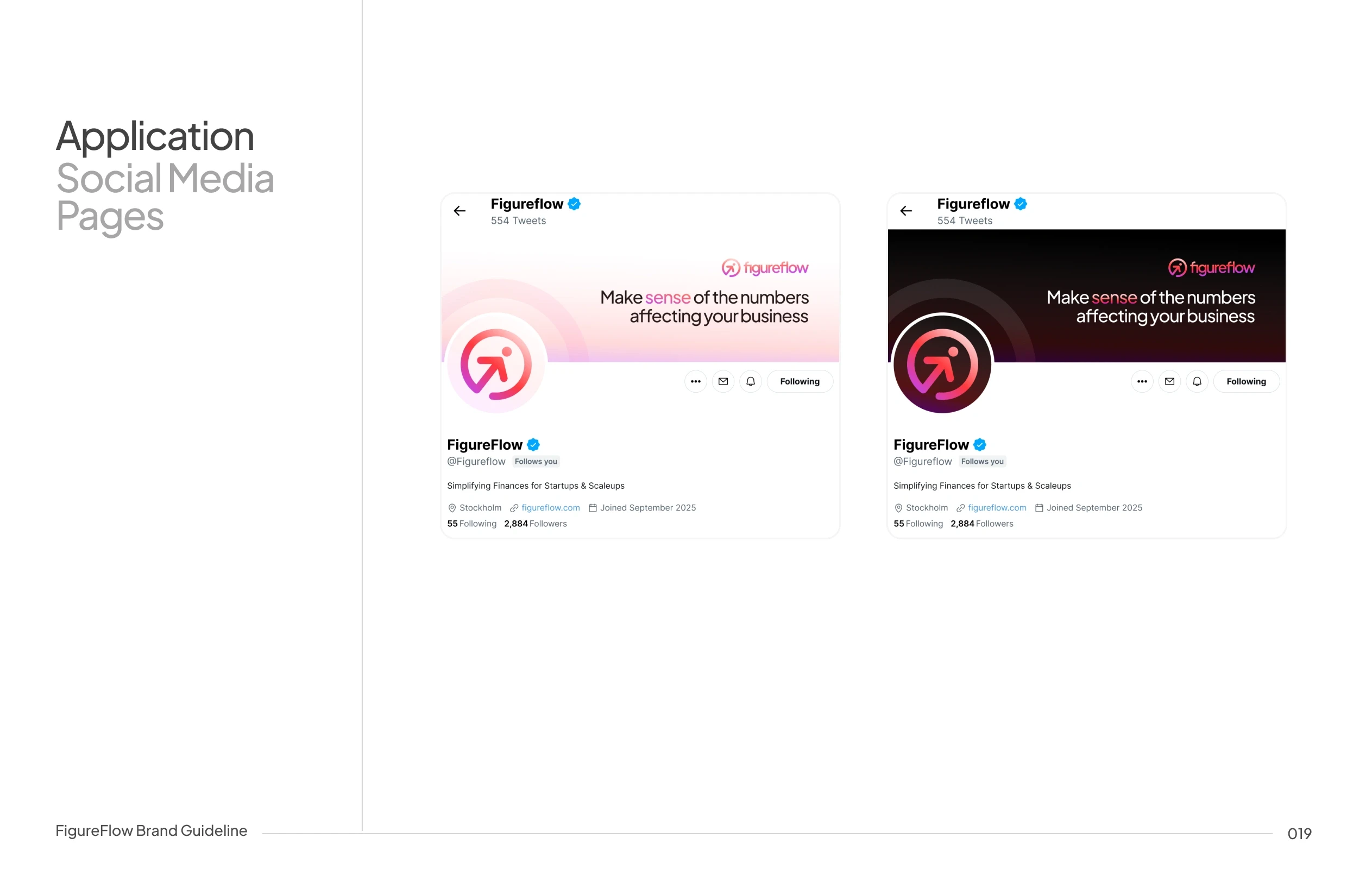
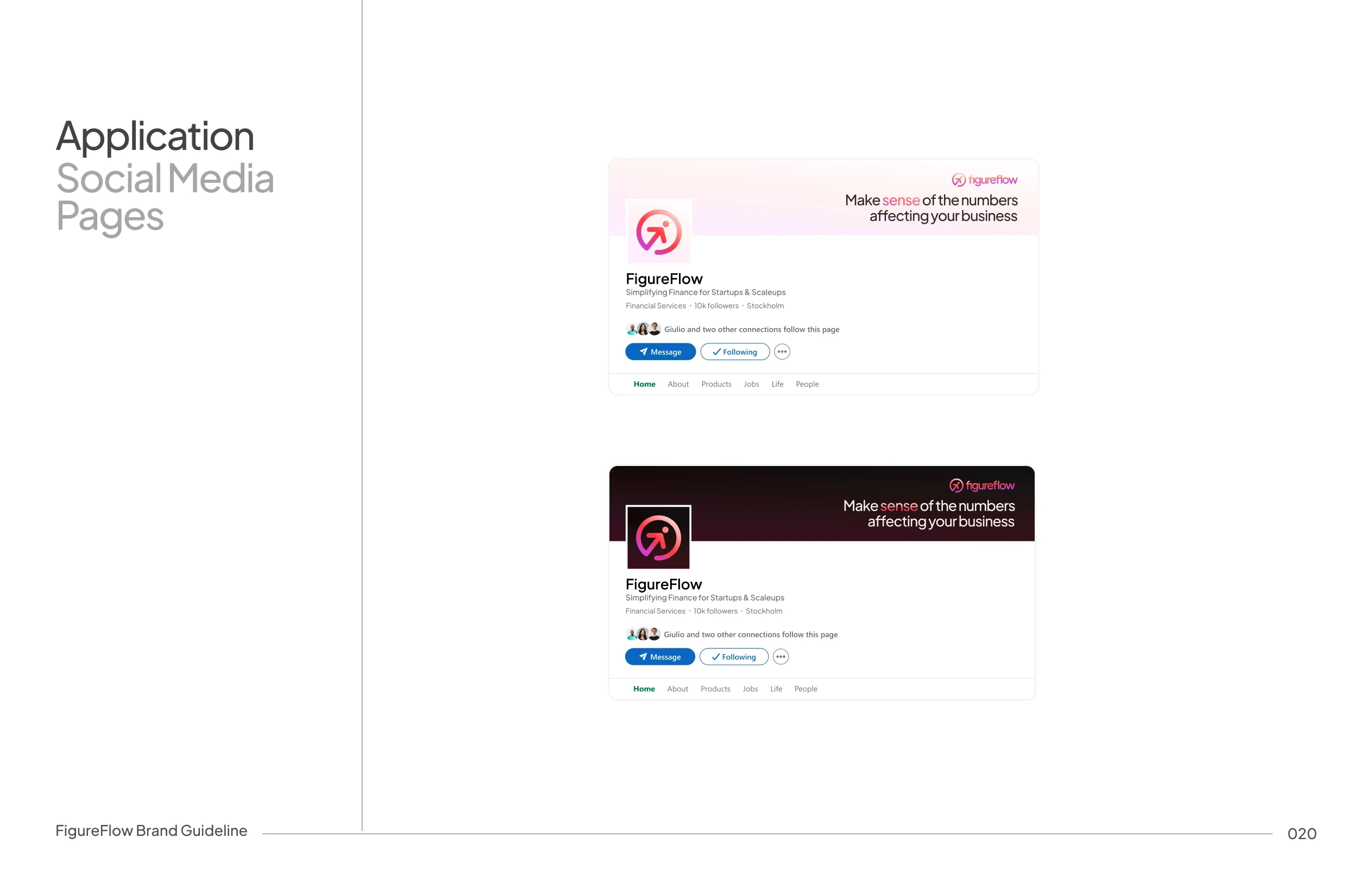
- Social media, motion and launch assets
- Pitch decks
- Financial reports